Beginning Principle: A Retro-Arcade Sans Serif for Digital Impact
As a UI designer who ships landing pages, SaaS dashboards, and boutique e-commerce sites, I’m constantly balancing personality with performance. That’s why Beginning Principle stands out—not as another decorative novelty, but as a purpose-built sans serif typeface that delivers retro energy without sacrificing digital legibility or layout control.
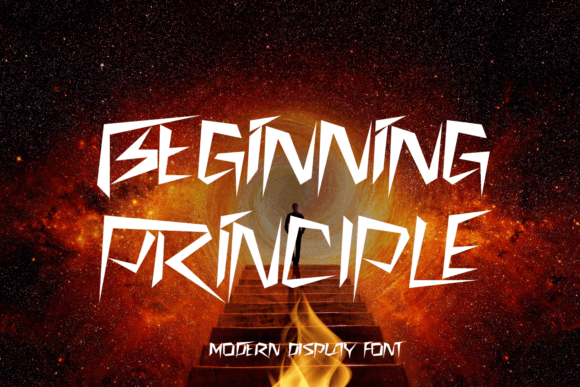
Beginning Principle is angular, decisive, and rhythmically structured—its diagonal strokes evoke 80s arcade cabinets and early digital interfaces, but its proportions, spacing, and open counters are engineered for modern screens. It’s not pixel-perfect nostalgia; it’s refined retro. The characters avoid excessive distortion, maintaining consistent x-height and generous letterfit—so headlines breathe, buttons scale cleanly, and short phrases hold visual weight across devices.
Where Beginning Principle Earns Its Place in Your Design System
This isn’t a body text font—and it shouldn’t be. Beginning Principle thrives where attention needs direction: hero section titles, product name displays, CTA buttons, course module headers, and brand lockups. Its strong geometry creates instant visual hierarchy, guiding the eye before users even read the words.
On a coaching website, pairing Beginning Principle with a neutral sans serif like Inter or Manrope for body copy builds contrast without chaos. The angularity of Beginning Principle signals innovation and confidence; the clean supporting font grounds the experience in clarity and trust. For an online store selling handmade electronics kits, using it on category banners (“Circuit Lab”, “Build Mode”, “Signal Flow”) adds tactile energy while staying scannable—even at 24px on mobile.
Readability in Real Layouts—Not Just Mockups
I test every font on actual devices—not just Figma previews. Beginning Principle holds up well on responsive layouts when used intentionally: at 32–48px on desktop hero sections, 28–36px on tablet, and no smaller than 24px on mobile viewports. Its sharp angles remain crisp on Retina displays, and its moderate stroke contrast avoids blurring on lower-DPI Android screens.
For dark-mode interfaces, it performs reliably against charcoal or deep navy backgrounds—just avoid ultra-thin weights (if available) for small UI labels. On light backgrounds, it gains extra punch with subtle letter-spacing adjustments (+0.5–1.0px). When overlaid on image banners, use a soft background tint or subtle text shadow to ensure contrast meets WCAG AA standards—especially for CTAs like “Launch Demo” or “Get Early Access.”
Smart Pairing for Cohesive Brand Identity
Beginning Principle works best when paired with typographic partners that respect its character without competing. A geometric sans serif like Poppins or IBM Plex Sans provides clean, functional contrast for navigation, forms, and captions. For editorial-leaning sites—a design blog or creative course platform—try pairing it with a warm, low-contrast serif like Lora or Cormorant Garamond for article headings and pull quotes. This combination signals both authority and approachability.
Avoid pairing with other high-contrast display fonts or script fonts unless you’re designing a single-purpose graphic (e.g., a social media announcement card). Beginning Principle carries enough personality on its own—it doesn’t need embellishment. Think of it as your brand’s “voice tone” in type: confident, forward-looking, and humanely technical.
Licensing, Formats, and Practical Integration
Before dropping Beginning Principle into production, verify its webfont support: WOFF2 files are essential for fast loading, and variable font options (if offered) simplify weight management. Check whether the package includes true italics—not slanted romans—and confirm multilingual coverage if your audience spans European or extended Latin scripts.
This is a commercial font, so licensing matters. For client websites or SaaS products, ensure your license covers web embedding, unlimited pageviews, and usage across staging and production environments. If you’re bundling it into a Figma community file or selling a WordPress theme, confirm redistribution rights. Most reputable foundries offer clear tiered licensing—don’t assume desktop use covers live sites.
Use Cases That Shine With Beginning Principle
- Creative portfolios: Use for project titles and category filters (“Motion”, “UI Systems”, “Brand Experiments”)—its angularity mirrors intentional design thinking.
- Product landing pages: Apply to headline + subhead combos (“Begin With Principle. Build With Purpose.”) to reinforce messaging through form and function.
- Digital course sales: Deploy on module badges (“Week 3: Core Logic”, “Bonus: Debugging Lab”) to add structure and momentum.
- Branded web content: Use sparingly in blog headers or newsletter banners—never full paragraphs—to maintain impact and accessibility.
- App onboarding flows: Leverage its clarity at 20–22px for step labels (“Connect”, “Customize”, “Launch”)—the diagonals subtly imply forward motion.
Beginning Principle doesn’t try to be everything. It’s a focused display font—a deliberate tool for moments where typography must do more than communicate: it must resonate. In a landscape crowded with safe, algorithm-optimized fonts, it offers authenticity with intention. You won’t use it for paragraph text—but you’ll reach for it every time you need a headline to feel like a promise, a button to feel like an invitation, or a brand to feel unmistakably *yours*.
When your digital identity depends on consistency—not just across pages, but across perception—Beginning Principle becomes more than a typeface. It becomes part of your design language’s grammar: concise, directional, and quietly unforgettable.